As someone who does a lot of pixel art, I am sometimes asked for help by people hoping to learn how to make pixelated graphics of their own. Unfortunately, I am not a terrific teacher. However, I got to thinking the other day that perhaps I’ve just gone about it the wrong way. So, here in this article, I will be providing you with a sort of organic, hands-on exercise that may help you learn by doing rather than by reading alone. In this exercise, you will be creating a small-scale sprite out of a larger image. So without further ado, let’s get into this.
1. Get an Image-Editing Program
You’ll need an image-editing program that can handle layers. What this means is that you can draw on one layer (like, say, a background), and then you can draw on a layer over that (for example, people walking about on the background), and whatever you draw on the second layer doesn’t erase or modify whatever you drew on the first layer. A good and fairly simplistic tool for this is Paint.NET, which I highly recommend for this particular task, but you can also try something more involved like GIMP if you so choose. I will be writing this article under the assumption that you’ll be using Paint.NET, but if you’re familiar with another tool, the functionality I describe should be easily translatable.
2. Find an Image
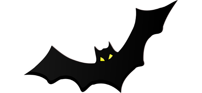
We’ll start off by finding a picture to trace. Let’s choose something simple that can be easily scaled down. I’m going with this bat here:
You’ll notice that this is quite possibly one of the most simplistic cartoon bats that I could have used – it has only two colours, no real shading, and no outlines. If we were tracing art at a bigger scale, like say for a game cutscene or title screen, then we’d want more detail, but we’re going to be scaling this thing down to the size of an ordinary game sprite, so the less detail, the better. You can download this particular image right here if you’d like to follow along.
3. Scale Down the Image
Traditionally, 2D game sprites are drawn at a base 16×16 pixel level. Pac-Man and his ghost enemies, for example, all fit within 16×16 pixel squares. Link in The Legend of Zelda: Link’s Awakening also fits within a 16×16 square, but Link in The Legend of Zelda: A Link to the Past is about 1.5x as tall… but he is made up of two sprites drawn together, a head and body, both which fit within individual 16×16 squares, and even when they’re put together, his hitbox (the area that actually collides with walls and monsters and stuff) is either 16×16 pixels or smaller. The point is, sprites are small. I cannot stress this enough, because I have seen people try to draw humongous pictures and call them “sprites” and then wonder why they won’t fit into their, uh, RPG Maker games.
So, open your picture in the program you selected in step 1. Select the “resize” option (in Paint.NET, this is under Image > Resize). Since the bat is wider than it is tall, and we want to fit it as neatly into 16×16 pixels as possible, let’s make the height 16 pixels and allow the width to expand beyond that dimension. In the box labeled “height”, displaying units in pixels, change that to “16”. Make sure that “maintain aspect ratio” is checked. This should automatically resize the width as well. Choose “best quality” so that the scaled-down image doesn’t become all jaggedy and aliased.
Here’s what the bat looks like now:
![]()
That’s the actual size. For the purposes of visibility in this article, I’ll be showing you pictures that have been scaled up 2x from here on out, like so:
![]()
4. Add a Layer
This is easy. In your “Layers” window, just click the “Add New Layer” button (it should be at the bottom-left if you’re using Paint.NET). You should see two layers in the window now. Make sure the topmost one is selected.
5. Trace and Fill
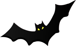
Zoom in a lot, then take a Pencil tool and trace an outline around the image. Choose a colour other than black, so you can see it (alternatively, you can adjust the brightness of the bottom layer to fade it and make it easier to trace, but I won’t be detailing anything so fancy here). I chose purple. Fill it in as you go along, making all of the black parts purple (or whatever colour you chose). When you get to the eyes, make them a different colour, like yellow. You should end up with something like this:
![]()
On the left is a picture of how it looks when it’s on top of the original, scaled-down art, and on the right is a snapshot of how it looks with the bottom layer disabled (this is the “true” sprite). It’s pretty bad right now, to be honest, but we’re just getting started. At this point, you may feel free to disable the bottom layer or delete it entirely, as it is no longer necessary to use and may just get in the way. If you’d like, go ahead and fill everything outside of the bat with white, to give it a background in lieu of transparency.
6. Draw an Outline
Using the colour black, draw an outline around your image. Make sure that the whole outline is only 1 pixel wide. This means that, if the line is coming down in a diagonal, each pixel should be joined only by their corners. Here’s an example – the right is what you should NOT to do, and the left is what you SHOULD do:

And here’s what my bat looks like now:
![]()
The wonkiness of the shape is still not fixed, but the outline gives us some perspective, and unless you intend on making sprites that have no distinct black outlines, you’ll need it… and even if you want to render your graphics in a style more defined by shades of colour rather than thick, cartoonish outlines, you really ought to start with something easy like this anyway. By the way, you may notice that my bat is missing one black pixel at the bottom of its lowermost wing. This is perfectly fine. One thing you need to know when working with small-scale pixel art is that outlines don’t need to be completely enclosed 100% of the time. In fact, striving to close every single outline will probably make your graphics look bad. There’s a certain finesse to making colours and outlines mesh well together so that when someone sees it, even at such a small scale, they can recognize what it is and find it to be visually pleasing.
7. Fix the Shape
The shape of your traced sprite will almost never be right the first time you do it. This is why you’re not just scaling down pictures with no anti-aliasing and hoping for the best. There is an art to this, and therein lies the whole reason why we’re doing this exercise: because you NEED to fix the shape. You need to look at this picture, understand what’s wrong with it, and fix it. I’m not setting you down and telling you to draw a whole sprite on your own. Instead, I’m giving you something to trace, giving you a distinct shape, and then telling you to fix it.
So what’s wrong with the bat?
Well, first of all, the bottom of the body joins into the rightmost wing (and, to a lesser degree, the leftmost wing) like they’re all one big chunk. We need to better define the divide between the two. Also, the wings themselves look rather terrible. We should probably give them just a little more detail, maybe those jaggedy points at the bottom that bats have, so that maybe they’ll look more like wings and not just big polygons sticking out of a blob. The ears are alright, but they could also use a little work. I’ll let you sort out the details of how to do this on your own, but here’s what I did with my bat:
![]()
From left to right, here’s what I did: I gave the leftmost wing an extra “point” to better define what it is, and raised the divide between that wing and the body to make both of them distinct. I modified the ears quite a bit to make them look pointier, maybe like they’re sticking back. During the process, I left one purple pixel with no black outline. This allowed me to better define the leftmost ear while keeping both ears distinct. Placing a black pixel between the two would make the space look really thick and heavy, and we don’t want that – we want thin, pointy ears.
I heavily reworked the rightmost wing, making it skinnier and giving it points at the bottom and top (where the bat’s claw would be). This left the bat’s body looking like a weird blob sticking out, so I added some legs to it, which are floating backward as if it is in motion. Notice that the legs have no black outlines. As I stated before, this is perfectly acceptable. In fact, it looks much better this way – they can be seen, but they’re clearly much skinnier than any other part of the bat. That way, they look like skinny legs which are extending backward. Giving them full black outlines would make them look bulky and maybe even not like legs at all!
8. Add Shading
This is the final step. Our bat looks pretty good now, but it could use some shading to even better define it. The purple I’ve used for my bat is RGB 178, 0, 255. To make a darker shade of that, I simply cranked the value (HSV) down to about halfway (50), making the colour RGB 87, 0, 127. I won’t get into colour theory here, nor will I ask for anything more complex than two shades per colour.
Now that we’ve got our darker shade, where and how do we apply it? Well, first, imagine where the light is coming from. It’s probably coming from the top of the bat. So we’ll want the top of the bat to remain lighter, leaving the bottom darker. We should apply shading to the bottom of the bat’s body, coming up the sides a bit. Bats have weird little spindly bones in their wings, which often show up beneath their skin as a different colour or shade than the rest of the wing. Since those bones run along the top, let’s leave all the boney parts light and make the skin between them dark. As for the legs, let’s give them just enough shading to leave thin, diagonal lines of light purple – this actually serves the purpose of giving them a bit of an outline and definition without oversaturating the image in black.
Here’s my final bat:
![]()
It’s hastily-made, but it works, and it doesn’t look bad. Hopefully, yours also turned out well. If not, don’t be discouraged – keep practicing. That’s the key to success with pretty much anything. In fact, even if your image did turn out super well, keep practicing anyway. Try tracing different things other than bats, and if you get stuck or confused, take a look at sprites of similar things from existing games. For further study, I highly recommend The Spriters Resource. People upload sprite sheets and tile sets from all kinds of games from all types of consoles there. You can download them and open them up in your image editing suite of choice (honestly, MS Paint is typically fine), then study them close up to see how they’re put together.
Latest from TandemShock


